#61 - Iterating against misfits towards a better interface
What navigating the messy middle when building a new feature feels like

This is a case study about a feature I designed and built in CLRA, a product discovery tool currently in closed alpha. It's not concise. Devils are in the details, and the details are the point.
I've written a lot on this newsletter about form-context fit and the messy middle of product work, but mostly as concepts. This post is the same ideas in their working form: an actual misfit I noticed in my own tool, an obvious first solution that almost shipped, the moment I realized it was wrong, and the form that eventually replaced it. I spent more than a week on this feature, and it was worth it.
If you're looking for frameworks, this is not the right piece. If you want to see what engaged product discovery actually feels like from the inside, read on.
Join us on the journey towards better product discovery practices
Problem & misfits
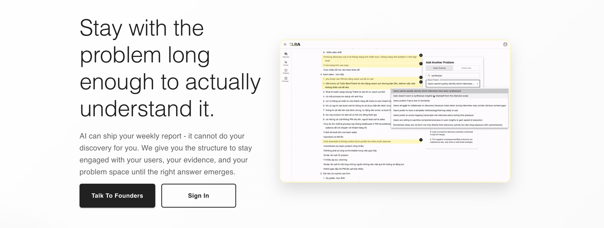
First, let me give you some context. CLRA is an engaged interface for product discovery based on our own opinionated worldviews and workflows. Users can use CLRA to build research plan, interview users, extract highlights, create problems and prioritize them. It's shift-left of Jira/Linear/whatever ticket management systems you're using. It's a tool for staying in the problem space.
Within CLRA, there's a view that simply lists out all the problems in your workspace. Problems can come from user interviews or from your own experience of using the product. The view is a flat list of problems that looks like this:
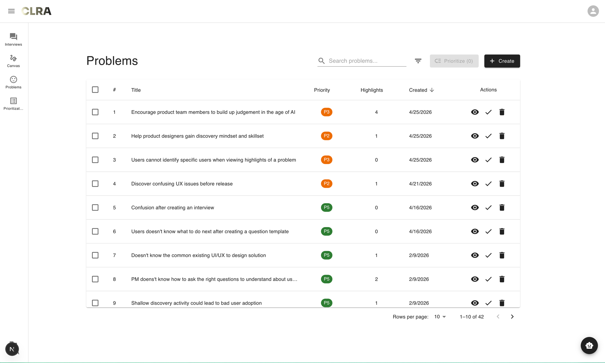
It is a pretty standard list view - a form that you can find in almost any modern digital products. However, as a PM trying to navigate the problem space, there's an irking annoyance when looking at this list. Let's explore that further.
Hre's a job story that I articulated:
When I'm in the process of refining my user understanding by looking through the problems I've captured during interviews or from experience
I want to understand the existing shape of the problem space,
So that I can identify what problems I should flesh out
Comparing the current problem list view as a form against this context reveals several misfits:
- First, the flattened problem list view prevents users from seeing the multi-dimensional nature of the problem space. Currently, dimensions are collapsed into fields such as "Priority" or "Highlights" in list, but they do not tell me if a problem is worth taking seriously.
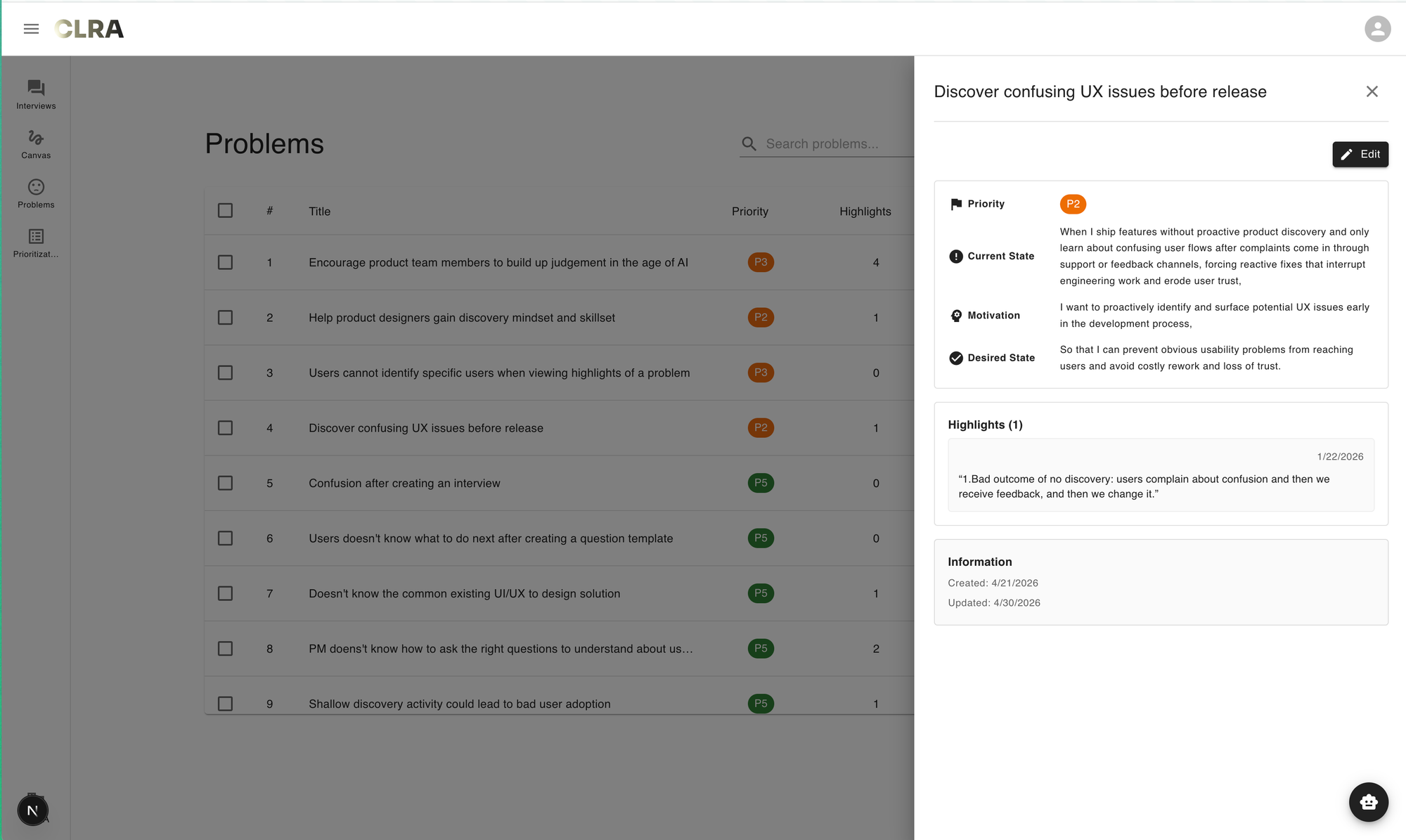
- Second, it's difficult to understand the structure of a particular problem. In CLRA, a problem is defined as a job story, because we believe that this format encourages clarity and forces users to contend with details, rather than merely writing a single statement. Currently, the job story structure behind a problem is only visible as one clicks on each problem to view its detail.
These misfits can be reframed into to a single, more fundamental underlying misfit: the flattened structure of a list fails to reveal the structural quality of the problem space. By structural quality, I mean the quality with which we judge whether the structure of a problem is sound or problematic. The collapse of multiple dimensions and structural opaqueness make problems' quality difficult to ascertain.
The first iteration: trying out an obvious idea
So what is a form that addresses this misfit? My initial solution was simple - a naive answer to the question: what indicators would reveal the structural quality of a problem?
The naive answer is, of course, coherence, i.e how the causal chain between context, motivation and outcome holds together. The intuition behind this comes from teaching 13 cohorts of BPM. You would be surprised at how incoherent written job stories can be. Coherence is a signal for structural quality of a problem. Following this reasoning, the feature could look something like this: let LLM evaluate coherence on individual problems, and allow users to prioritize them based on coherence score.
I didn't actually implement on the frontend to have a screenshot for you, because as I began to play around with a backend implementation with LLM, I noticed that some job stories that were "good" in my estimation but somehow scored low in coherence. For example, here's a job story that scored low in coherence that I found surprising:
When I join the current company as a new product designer, I get to experience the product with fresh eyes, and I noticed several confusing issues so I proposed a redesign to fix them, but my stakeholders said my proposed redesign is "too difficult to use" which surprised me, I'm not sure what I noticed were personal biases or real issues
I want to leverage user insights to validate my design intuition
So that I can avoid negative feedback from my stakeholders
The second iteration: notice what's off
My first reaction was "but there are very interesting details!" After a few moments, I realized that, implicit in my own judgement of what constitute quality, richness of details was another important aspect that's almost orthogonal to coherence. The job story above had interesting details, but the causal chain from situation to motivation to outcome was shaky. Why would the motivation involve leveraging user insights in that situation? Why avoiding negative feedback was desirable? You can squint and see those connective tissues, but they're not explicitly articulated yet.
Then an observation hit me like a truck in an isekai anime sent to reincarnate its protagonist: often when we revisit interview notes and extract job stories, initial articulations tend to focus on capturing interesting details - sometimes even at the expense of coherence. I further claim that, it is easier to enhance the coherence of a job story already rich with details, than improving the richness of a coherent but minimal job story.
Richness of details are evidence from conversations with users. They can be messy, but they're load-bearing facts. In contrast, coherence is all about interpretation: you can make sense of rich details and give them a coherent shape. Going the other direction - adding details to a coherent-but-thin story - requires either going back to the user (expensive, sometimes impossible if the interview is over) or fabricating texture that wasn't observed (which corrupts the artifact). There's no purely interpretive move that gets you from thin to rich. You need new input.
By the way, the worst kind of job stories are those that don't make a lot of sense and contain very little details (which beginners tend to produce).
That said, it's not about choosing one or the other. I'm just telling you what went through my mind at the time that explains why a "good" job story could be low in coherence but high in richness. While capturing rich details into initial job stories is better than trying to force coherence prematurely, both dimensions are important to determine the quality of a problem. After all, you can't address a problem that's too incoherent.
With this refined intuition, the solution was to leverage LLM to evaluate both coherence and richness of the job stories and produce coherence scores and richness scores. This is the crux of the final solution.
The third iteration: figuring out the plot
So I had two scores per problem now. The question was how to surface them.
I did try the obvious thing first: adding two columns to the existing list, coherence and richness, sortable. It took maybe ten minutes to mock up. I looked at it and didn't like it. Couldn't immediately say why though, so I sat with that for a while. The list looked fine. The scores were there. You could sort by either column. Nothing was technically wrong with it. But something about it kept feeling off, and I didn't want to move forward until I could put my finger on what my intuition was saying.
Eventually I got there: I'd just spent a section of my own thinking arguing that rich-but-incoherent and coherent-but-thin are different in kind - one is improvable, the other is a trap. That argument only makes sense if you can see the two scores together and quickly differentiate between these two kind of job stories.
The two-columns version let you sort by one or the other, but it never let you see the relationship between them. In a list view, sorting by coherence puts the tight stories on top. Sorting by richness puts the detailed ones on top. Neither sort shows you the rich-but-incoherent quadrant I'd just spent days arguing was the most interesting one. I mean, you could theoretically read both coherence and richness scores of a particular problem, hold them in your mind and mentally compare them against another problem. But that would be very cognitively taxing.
In short, the list was still doing list-things - ranking items along one dimension at a time - and I needed a form that did 2D things. Once I named it, the form follows naturally. The plot of this blog post also revealed itself. Scatter plot, to be precise. Each problem a point, coherence on one axis, richness on the other. It felt much better than a flat list, good enough that I can start my prototyping session.
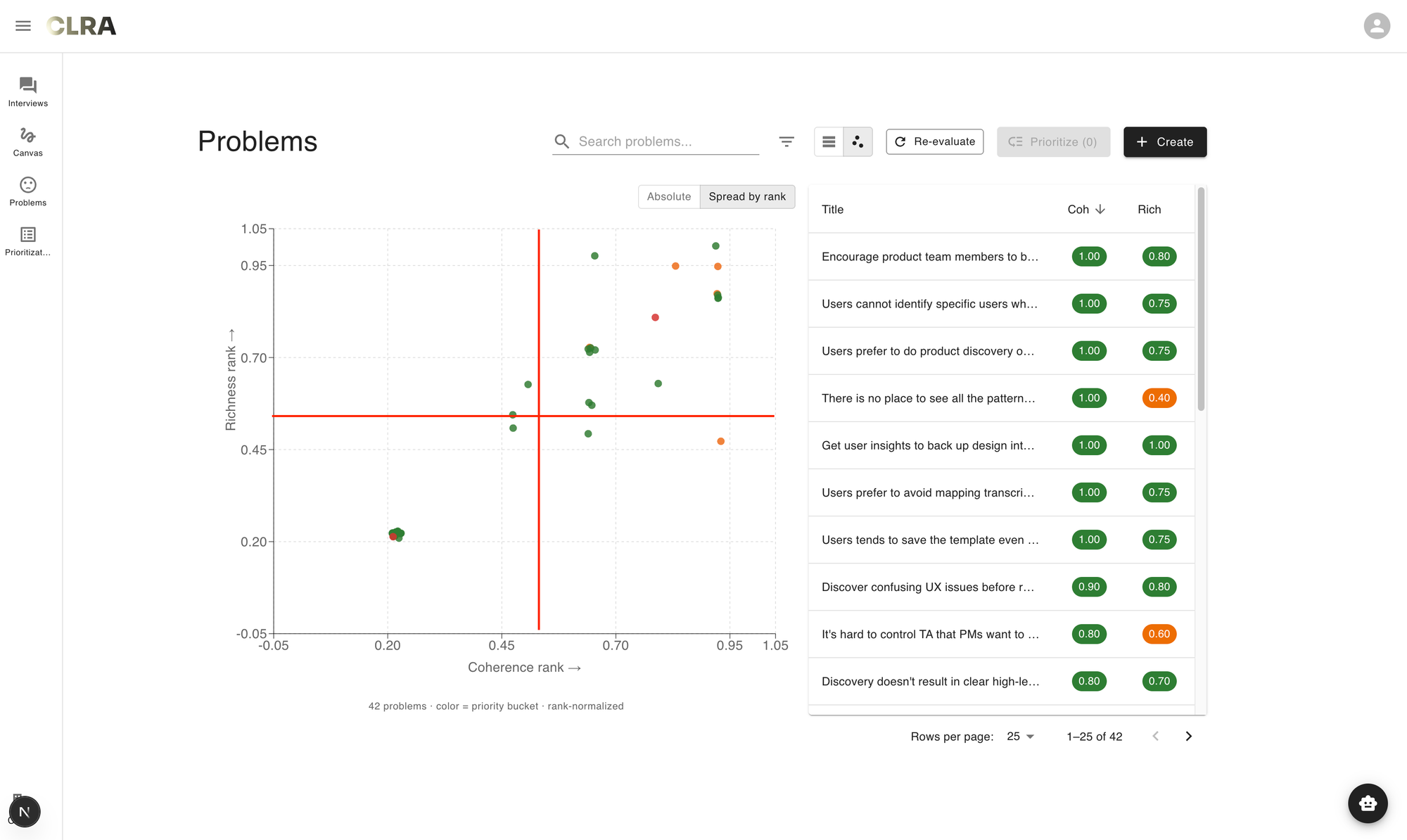
What I didn't anticipate, and only noticed once I'd been using the view for a few days, was that the quadrants started carrying meanings I hadn't planned for.
- The top-right was the obvious one - high on both, ready to take seriously. In fact, most of my job stories are in this quadrant.
- The bottom-left was junk, mostly placeholder problems I hadn't finished.
But the two off-diagonal quadrants turned out to be the interesting ones, even though they were sparsely populated.
- Bottom-right, high coherence and low richness, was where my own laziest articulations sat - clean stories I'd written quickly without going back to the interview notes.
- Top-left, high richness and low coherence, was where the genuinely interesting unresolved problems were, the ones still wrestling with what they meant. There weren't many points in either quadrant on any given day, but the ones that did land there earned more of my attention than the comfortable cluster on the diagonal. I didn't design the view to surface this. The view just made it visible once I started looking.
Linus Lee wrote in "What makes a good human interface":
A good engaged interface makes visible what is latent. In that way, they are like great maps. Good interfaces and maps enable us to more effectively explore some domain of information by visualizing and letting us see the right slices of a more complex, underlying reality.
Data visualizations and notations, the backbone of many kinds of graphical interfaces, are maps for seeing better. Primitives like charts, canvases, (reverse-)chronological timelines, calendars, are all based on taking some meaningful dimension of information, like time or importance, and mapping it onto some space.
If we take some liberties with the definition of a data visualization, we can consider interface patterns like the “timeline” in an audio or video editing app. In fact, the more capable a video editing tool, the greater variety of maps that tool offers users, enabling them to see different dimensions of the underlying project. An experienced video editor doesn’t just work with video clips on a timeline, but also has a “scope” for visualizing the distribution of color in a frame, color histograms and curves for higher-level tuning, audio waveforms, and even complex filtered and categorized views for navigating their vast library of source footage. These are all maps for seeing information clearly from diverse perspectives.
The form I eventually arrived at indeed helped me see my problem space better. That's good progress, I think.
I also went through a few more iterations to resolve a few other misfits, but I feel like they're a bit too technical for this post. Here's a demo video of what the feature ends up feeling like:
Conclusion
Looking back, the hard parts were noticing that coherence alone was missing something, sitting with the discomfort of the two-column list long enough to name what was wrong with it, and being willing to throw away an obvious form for one that took more work to build. None of those moves were strictly necessary. I could have shipped a coherence score on day one. I could have shipped the two-column list a week later. Both would have looked like progress.
I think this is what messy-middle work actually feels like - a series of small refusals to settle for the form you have (hold on a bit more when you feel like releasing), even when the form you have is technically fine. Each refusal buys you a little more clarity about what you're actually trying to surface, at the cost of velocity. The trade is hard to defend in the moment because the thing you're refusing always looks reasonable enough. It's also harder to do this when you keep being told "move fast and break things", but it's really worth it to slow down and notice subtle misfits.
The view I ended up with might still be wrong. I've been using it for a couple of weeks. The quadrant meanings I described may turn out to be artifacts of my particular workspace and not generalize to other users. The implementation has friction I'm still working through. Closed alpha is the right name for where this is.
But for now, when I open CLRA and look at my problem space as a scatter plot instead of a list, I can see things I couldn't see before. That's the only claim I'm willing to make. Whether it stays that way - whether the form holds up as more users land in the tool, whether the two dimensions are the right two, whether the quadrant readings survive contact with other people's problem spaces - is a question for the next iteration.
Join us on the journey towards better product discovery practices